FEATURES
REVIEWS EDITORIALS
THINGS TO COME
ARTICLE 10

>> Editorial: Cassandra Complex: Curtain Calls & Cyberpunx
>> Editorial: Cassandra Complex - Writers & Wringers
More...

It's 3 a.m. on the dot. And here I am writing a column.
I shouldn't be surprised - the last few weeks have been murder. Excuse me if this month's Cassandra Complex is a little...fractured.
In the last four weeks I've found a new place to live with my girlfriend; jumped through unfeasibly time-consuming hoops arranging the move; spent hours on the phone sorting out a problem with my bank; and hit multiple deadlines, putting two magazines to bed.
("Putting magazines to bed" - a curious publishing industry slang phrase. More later.)
Add all this to the various comics deadlines I've had to meet, and you can see why being awake at 3 a.m. is nothing new, these days.
If there's one thing the last few weeks have taught me, it's time management...
The problem there being, the first thing to be managed out when I've got this much work to do is, well, anything that isn't work. I haven't read a comic in five weeks, and I haven't got a damn clue what's happened in the industry during that time.
So anyway. As I normally write about 'the industry' in this column, that could pose a problem. But there is one thing which has really caught my eye, and you probably don't think it's that big a deal, but you'll understand in a moment:
'From a designer's standpoint, trade dress has been improving over the last few years.' DC Vertigo editor Karen Berger announced on ICv2 that Vertigo is changing its trade dress.
About as interesting as watching ink dry for most people, I'm sure. But for me, this is genuinely interesting. Why? Because I'm a Vertigo Zombie? Because this will at last herald the acceptance of comics in mainstream culture and validate the artform in the eyes of the great unwashed?
No. Because I'm a graphic designer, and this is exactly the sort of thing I bang on about to anyone polite enough not to run away...
I'm an art editor (I believe the equivalent US title is "art director") for magazines. I design them for a living. They're 'consumer' magazines, i.e. the type you can buy in any store or newsagent. And I love it; periodical design, for whatever reason, really fires me up. I've literally moved cross-country (twice!) to stay in this business.
Every nineteen working days, I design a complete magazine. It must look similar to the last issue, but also different enough to be interesting and complement that issue's contents. It has to maintain the magazine's brand, but stand out enough that people will pick it up, browse through it and - hopefully - buy it. At the end of every nineteen-day cycle, I put the magazine through pre-press and send the finished artwork off to the printers, where - as far as my job is concerned - the cycle ends.
I put magazines to bed.
The point being, part of this - some say the most crucial part - is designing the cover. A new one every issue. It has to have the usual logo, all the same legal and retailer information as it always does, but be totally different to every other cover the magazine has previously had.
Which isn't that far removed from monthly comic covers, and the trade dress that has to go on them.
(If you're still with me, I'm assuming you know what "trade dress" is - on a comic it's basically everything that isn't the picture. The comic logo, the publisher logo, the barcode, the creators, the issue number, and so on. Click the ICv2 link to see mockups of the new Vertigo style.)
Now, trade dress is something that has, from a designer's standpoint, slowly been improving over the last few years in comics. Subtlety and quick, easy communication of information have become the order of the day. The Designer's Republic has had a lot to answer for over the last ten years, but thankfully most of it's good.
Part of trade dress' job is to maintain a visual brand identity; to create a consistency not just from month to month, but simultaneously across a range of titles. (The need to keep this brand identity is almost certainly the reason why the Vertigo logo itself isn't changing.)
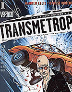 And truth to tell, I quite like the existing Vertigo trade dress (right). It's a thin strip down the left-hand side of each comic they publish, with all the information on it in small, clear type. Sometimes it's
on a semi-transparent background to make it legible against the cover image.
And truth to tell, I quite like the existing Vertigo trade dress (right). It's a thin strip down the left-hand side of each comic they publish, with all the information on it in small, clear type. Sometimes it's
on a semi-transparent background to make it legible against the cover image.
It's unobtrusive, easily digested and fairly modern looking, without being 'painfully trendy'. Evidently, someone at Vertigo feels it's not modern enough.
Understand: redesigning is a staple of any publication. Just look at how often magazines relaunch with a "Bold New Look!" And it's a good thing - it keeps the magazine fresh, the designers interested, and the sales figures buoyant. (At least in theory; most readers don't care about the design beyond, "can I read it without burning my eyes", and that's fine. Designers work subtle and subconscious tricks into their work to ensure that even if you don't realise it, your brain is shouting, "Hey, this looks pretty interesting...")
So redesigning the Vertigo trade dress, even when there really isn't anything wrong with it, is actually a fairly normal and sensible move. The ICv2 article implies that Karen Berger wants to give the Vertigo line more of a 'magazine' look and feel, but I don't buy that, because the design challenges are entirely different. No consumer magazine has to put anywhere near as much legal/indicia information on the cover as a comic, for a start. When was the last time you saw a magazine with a list of the feature writers and photographers on the cover?
What Berger is actually quoted as saying is, "[W]e wanted to set ourselves apart ... and create the sense that it's provocative stuff under the cover."
Now that sounds more like it. That's the task of every publication cover, be it magazine, comic, CD, even a newspaper (though they generally do it with words more than pictures and graphic elements). 'Provocative' sells.
And, looking at it, I think that much is clear anyhow. The new trade dress looks very little like any magazine dress I've seen - mainly because of that sheer amount of information.
How does it look from a designer's standpoint, though? Well.

It's pretty modern. The use of rounded corners on boxes, not so long ago seen as very '80s, has enjoyed a bit of a retro resurgence in the last few years. You can mostly blame that on advances in the presentation (and menu screens) of video games; also, to a lesser extent, the current fad for 50s catalogue retro.
The varying sizes of type are nothing new - Vertigo did it before in the early 90s, a time when it was becoming about as passé as stretched type thanks to the proliferation of desktop publishing. But this time it's at least clean and undistorted, bringing to mind film posters more than band fliers.
Those little white separator lines are interesting. They started appearing on UK magazine covers a couple of years back, to break up the areas where secondary and tertiary 'hits' are placed. It's a 'grid thing', increasing the idea in the reader's mind that the design of this publication is deliberate, considered. They also artificially break elements down, marking each piece of information out as an entity in and of itself, which presents the illusion of speed when reading it. You can read one element quicker than you could read two, and your brain is therefore fooled into thinking it's digesting all this information more quickly. On covers, this is essential; common wisdom has it that most 'rack browsers' only look at each cover for 3-5 seconds before moving on unless they see something of interest.
This, along with the clean type and plain, two-colour scheme, implies that Vertigo actually wants you to skim over this trade dress pretty quickly, getting to the artwork - the 'meat' of the cover - as soon as possible.
 But the shape, and the so-called modular elements that make up that shape give the opposite impression (especially when given a square-ish shape, as in the 100 BULLETS mockup).
It's also interesting to note how much this trade dress evokes the covers of Paul Pope's HEAVY LIQUID, which Vertigo itself published in 1999. On those covers, however, the dress was a very bold and integrated part of the cover design, which drew attention to itself much more than these designs are intended to do.
Those modular shapes are clever, though - nothing taxes a designer more than being presented with a cover image that just won't fit into the 'usual' cover layout template. Vertigo Art Director Maria Cabardo has neatly sidestepped this issue by creating elements that can be shifted around and placed in varying orders, to suit each individual cover.
So, we have a design that draws on contemporary elements and styles, using them in a clear manner. It wouldn't look too out of place on a CD cover.
The problem is...well, I think it's a little too contemporary. It looks great now, but come next year those rounded corners are going to look more than a bit dated. The typeface itself, while clear and communicative, has some odd elements that, again, may date quickly.
And I find I disagree with one specific thing Berger says - that these designs are clearer, with "less schmutz on the cover". If anything, these designs actually draw more attention to themselves than did the previous trade dress; the AMERICAN CENTURY mockup is certainly the only usage I can imagine that won't leap out of the cover.
All of which means, if Vertigo wants to stay ahead of the pack, as Berger claims, in a year's time they're going to have to redesign again.
Just like the rest of us in the periodicals industry.

This article is Ideological Freeware. The author grants permission for its reproduction and redistribution by private individuals on condition that the author and source of the article are clearly shown, no charge is made, and the whole article is reproduced intact, including this notice.
All contents
©2001-5