FEATURES
REVIEWS EDITORIALS
THINGS TO COME
ARTICLE 10
>> Editorial: Cassandra Complex: Curtain Calls & Cyberpunx
>> Editorial: Cassandra Complex - Writers & Wringers
More...

THE RAIN BRINGS WINDS OF CHANGE
I'm always the bloody guinea pig.
Astute readers will already have noticed, thanks to that little bold header up there, that this Cassandra Complex is a little different to previous instalments; Ninth Art's editorial columns are changing, into the cunningly named Editorials section, starting right here. The aim is to give the site's three waffling editors a little more freedom in our essays, and a better capacity to respond to recent events.
Well, here's a recent event for you, which has pretty much consumed my time over the last few weeks: I've taken the plunge and become a full-time writer. Now, it's true that this was exacerbated somewhat by the magazine of which I was Art Editor being closed. But, all modesty aside (quiet at the back!), I could have walked onto another magazine quite easily. I decided not to because, well, it just feels right. Now is the time, carpe diem, take the horn by the balls, and other misquoted aphorisms.
Over the coming months, therefore, you may well see CASSANDRA COMPLEX develop into something approaching my good friend Matt Fraction's column POPLIFE - a work journal-come-stream of consciousness - though probably without the monkeys.
Anyway. I promised my fellow editors I wouldn't use this new format to service my ego too much (Quiet at the back, I said!), so instead I'm going to talk about Things On My Mind.
And here's something that's been on my mind for a while...
ARE THESE NOT WORDS OF HERESY
 THE FILTH. Is it an ultra-postmodern satirical take on writer Grant Morrison's own magnum opus THE INVISIBLES? Or merely an exercise in wilful obscurity designed to see just how much bollocks Morrison can get away with and still sell the big numbers?
Personally? I reckon it's both. And it isn't the first time a cult favourite known for his pranks has conducted such an experiment - notorious guerrilla media satirist Chris Morris famously broadcast his surreal radio show BLUE JAM as late in the evening (often well into the next morning) as Radio 1 would let him get away with, just to see how many people would tune in regardless. Genius.
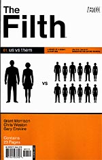
But. Love or hate THE FILTH, the one thing everyone agrees on is that the covers (designed by Carlos Segura, and I'm guessing they're all done in collusion with Morrison) are great. Brilliant, some have called them.
They rely entirely on typography and iconography - no comics art - and to the best of my knowledge are also the only comics currently published under the Vertigo banner which are exempt from the imprint's conventional cover branding. Morrison can get away with these things, you see.
And yes, they really are good, a well-executed unconventional use of conventional symbolism. The typography is clean and considered, the iconography relevant and intriguing, the layout clear and modern.
'There are so many options open to designers, yet comics utilise them so rarely.' Now, comics are already pretty good at iconography. Show people a red "S" in a pentagon, or a spider's web with two almond-shaped eyes in the middle, and most people - even the man on the street - will know what you're referencing.
But if there's one thing comics really aren't too hot on, it's typography. I'm not talking about lettering, here - the Western comics industry has some of the best, most overlooked calligraphers going. I'm talking about typography as a design element - the cover, the publisher's branding, the splash page credits. Pick up twenty new comics from your local store, and you'll be hard pushed to find more than two that wouldn't be dismissed by a trained typographer. And one of them would be THE FILTH, anyway.
This is what gets my goat (and yes, I know I've said it before, but it bears repeating); design of the quality seen on THE FILTH shouldn't be so rare that people fall over themselves to praise it. It's a comic - which doesn't have any comic art on the cover! Gasp!
Have you looked round a bookstore recently? Or a record store? There are so many options open to designers - so many ways of conveying a mood, an atmosphere, a story even - and yet comics utilise them so rarely it's incredible. We're locked into this notion that a comic must feature artwork on the cover - hell, there are still people who complain if the cover artist isn't the same person that draws the interiors - and it's for no good reason besides, "This is how it's done". Just like every other problem this industry has, then.
I mean, if you're in a comic store - or the GN section of a bookstore - and you need to see comic art on the cover to know that what you're looking at is a comic, then you need serious help.
Sure, Morrison has a certain pulling power (though god knows THE INVISIBLES never benefited from it), and THE FILTH was hyped up the arse before it was even solicited, let alone on sale. But one thing the series has already proven is that strong, eye-catching, unconventional covers will get people to pick up a comic. Good covers will get people talking just as much as good content (I'm certainly not going to suggest a great cover on a shit book will fool people), and word of mouth is as valuable as it's ever been.
If ever there was a time when designers could justify experimentation with cover design (experimentation for comics, anyway - just catching up with CD design would be a bonus), then this is it. Copies of THE FILTH should be pinned to every comics designer's wall; not as something to work towards, but something to work forwards from.
I'M IN A MOOD FOR TOTAL WAR
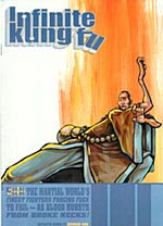 INFINITE KUNG-FU is probably the best title ever.
It's also one of the best comics I've read in the past few months. The title alone sold me, but how could I ever resist a first issue cover blurb that reads THE MARTIAL WORLD'S FINEST FIGHTERS FORCING FOES TO FAIL - AS BLOOD BURSTS FROM BROKE NECKS!
And you know what? It delivers. There's no point even trying to tell you what the story's really about - it twists and turns like hell, and you'd have to pull writer/artist Kagan McLeod's head apart to make full sense of it. What you really need to know is that it's chock-full of insane fights, cod profundities galore, and Kung Fu Zombies. Which makes it a fitting tribute to the kung fu movies McLeod evidently watches every waking minute.
(Kung Fu zombies, for heaven's sake! I mean, come on - sold or what?)
The energy in INFINITE KUNG-FU is amazing. The highly stylised art leaps off the page, and the pace is breathless. It's what most superhero books wish they could be; if you were allowed to rip your own limbs off and spear people with them in superhero books, that is.
If you have any interest in kung fu movies or action comics, you should own this. INFINITE KUNG-FU is three oversized issues, and I can hardly wait for a sequel.
THE GODS WHO ANSWER ME
As some of you may have guessed, I've been listening to a lot of VNV Nation lately. Five points if you guessed the artiste, and another five for each song you can name, as Sir James of Saville used to say...

This article is Ideological Freeware. The author grants permission for its reproduction and redistribution by private individuals on condition that the author and source of the article are clearly shown, no charge is made, and the whole article is reproduced intact, including this notice.
All contents
©2001-5