FEATURES
REVIEWS EDITORIALS
THINGS TO COME
ARTICLE 10
>> Top Nine: Yusuf's Choice
>> Alphabetti Fumetti: S is for Shooter
More...

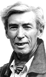 H is for Hergé
b. 1907, Etterbeek, Brussels; d. 1983
1929: TINTIN IN THE LAND OF THE SOVIETS; 1934: THE BLUE LOTUS; 1960:
TINTIN IN TIBET; 1976: TINTIN AND THE PICAROS
Beer, chips, and TINTIN; these are the things that Belgium is famous for. But where beer and chips are only good for making you drunk and fat, TINTIN is something that can be enjoyed over and over again without doing the least bit of harm.
The globe-spanning exploits of the intrepid boy-reporter and his faithful dog Snowy have enthralled millions of children and adults for over 75 years, and will probably remain as popular for a good while yet. Belgium is understandably rather proud of this particular cultural export.
There are two immediately discernible reasons for the success of the strip. The first is Hergé's ligne claire drawing style, which quite literally means 'clear line', in which every person and object in the panel is drawn with the same strong lines, rather than having one element emphasised over another. The second reason is Tintin himself, a character of unimpeachable moral values and instinctive heroism, ideals that Hergé took from the Boy Scout movement he loved as a child. Tintin was a role model whose adventures could be appreciated by all the family.
But as family entertainment, the strip is not entirely above criticism. The early years of TINTIN, as they appeared in the children's weekly supplement Le Petit Vingtieme, were marked by clunking national stereotypes and state propaganda regarding topics like communism (TINTIN IN THE LAND OF THE SOVIETS) and colonialism (TINTIN IN THE CONGO). There's an infamous scene in the latter where Tintin is giving a geography lesson to native students in a missionary school: "My dear friends, today I am going to talk to you about your country: Belgium!" To avoid further controversy, later editions changed this scene into a maths lesson.
By Hergé's own admission, these flaws were due to a lack of proper research and because of editorial edicts handed down to a young and inexperienced artist. The turning point came with THE BLUE LOTUS; it was announced in the previous storyline that Tintin's next adventure would take place in China, but before work began, Hergé received a letter from a chaplain at the University of Leuven that implored him to be sensitive about his subject matter. Hergé agreed, and began a habit of meticulous research that he would employ for all of his work thereafter. THE BLUE LOTUS portrayed China and its people in a positive light, but cultural stereotypes still abounded in its attack on the Japanese and British imperialists who occupied the country at the time.
During World War II, while Belgium was under Nazi occupation, Hergé took TINTIN to a different newspaper, and several important changes occurred in both form and content. Paper shortages meant that the strip was reduced from its original three-page format to half a page, so the rhythm of the stories was changed to squeeze in more slapstick gags and cliff-hangers at the end of every strip; and Hergé moved the stories away from current affairs and into escapist fantasy in order to avoid provoking the ire of the occupying forces. Consequently Hergé placed more emphasis on characterisation than plot, and it's no coincidence that colourful supporting players like Captain Haddock and Professor Calculus were first introduced during this period.
After the war, Hergé was able to secure financing to set up a Tintin magazine, and restored the strip to two pages a week. His work peaked with TINTIN IN TIBET, where the boy-reporter went in search of a lost friend. This storyline was being produced around the same time that Hergé was suffering both the breakdown of his marriage and recurring nightmares filled with whiteness. He decided to confront his nightmares by setting the strip in a bleak snowy landscape, something that spurred him (and his assistants) to produce the most breathtaking artwork of his career. The completion of the story coincided with the resolution of both personal crises, and is a unique example of Freudian psychoanalysis filtered through sequential art.
The final Tintin story, TINTIN AND THE PICAROS, is perhaps the most interesting in terms of Hergé's personal politics. In it, Tintin is reluctantly dragged into the affairs of a poor South American country. After he starts a revolution to topple one corrupt regime and replace it with another, the final image of the strip shows the military police patrolling a slum neighbourhood - evidence that things have not really changed for the better. After several decades wherein Hergé used the strip as a platform to satirise Communism, fascism, and imperialism, it seems that his final thoughts on the subject were wholly ambivalent. One political ideology is very much the same as another.
When taken as a whole, Hergé's adventures of Tintin serve as a fascinating meta-narrative of 20th century history, reflecting the constantly changing world around the man who wrote and drew them. On the surface, these stories were intended to provide entertainment and benevolent instruction to young readers. But over the course of several decades they also served to document every major social development from around the world, ranging from science to psychology, popular culture to politics. And that, in the end, is the loftiest goal that sequential art can aspire to.
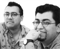
H is for Hernandez, Gilbert and Jaime
b. 1957 and 1959, Oxnard, California
1981: LOVE AND ROCKETS
 Part of the alternative comics revolution of the 1980s, LOVE AND ROCKETS is now a punk rock institution. Gilbert and Jaime Hernandez, otherwise known as Los Bros Hernandez, have spent nearly a quarter of a century pursuing their own personal ideas of what makes good sequential storytelling. The most obvious influence on their style (well, on Gilbert's, at any rate) is Steve Ditko, but both brothers have made a point of producing black and white comics with a European flavour that are beautiful to look at - not least because they are populated with gorgeous women.
Gilbert's main body of work is concerned with PALOMAR, aka HEARTBREAK SOUP, a story about life in a fictional village somewhere in Latin America. This strip contains many elements of magical realism, which some observers have attributed to a love for the books of Gabriel Garcia Marquez. Jaime's main project, HOPPER'S 13, aka LOCAS, follows the lives and loves of a group of Chicano characters from their teenage years into adulthood, with particular emphasis on the stormy relationship between Maggie and Hopey.
The brothers took the bold decision to break from traditional comics storytelling by depicting the effects of the passage of time on their characters, so that as the years pass they become visibly aged. This is most obvious with the depiction of Maggie, who started out slim and slender, but gradually gained weight because of depression and issues about her body image.
LOVE AND ROCKETS ceased publication with issue #50 in 1996, with the brothers going their separate ways with their individual projects, but was revived in 2001 as LOVE AND ROCKETS VOL 2. In the interim, Fantagraphics have published both PALOMAR and LOCAS as single volume hardcover collections, which you are strongly urged to rush out and buy at once.
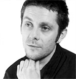
H is for Hewlett, Jamie
b. 1969, Chester, England
1988: TANK GIRL; 2001: Gorillaz
 Hewlett is an artist who has made a spectacular transition from the printed page into other media. Drawing inspiration from street culture and underground movements, his distinctive brand of art is a kind of nexus where comics, fashion and music meet, get drunk, and procreate to spew forth hundreds of hyperactive little kids to wreak havoc on an unsuspecting world. It's purely style over substance, and Hewlett wouldn't have it any other way.
TANK GIRL was his breakthrough, a fully fledged riot grrrl with a mutant kangaroo boyfriend and a propensity for ultra-violence. The stories were pure anarchy; slapstick humour set in a dystopian future with little rhyme or reason behind them. But the artwork was infused with a verve and energy that was difficult to ignore. TANK GIRL developed a cult following, and was adapted into a Hollywood blockbuster that promptly... ahem... tanked - and that was the last we saw of her. If only all popular icons would bow out so gracefully.
Everything was quiet for a while, but Hewlett resurfaced to collaborate with his old flatmate - and Blur front man - Damon Albarn on a music project called Gorillaz. Albarn was anxious that his negative public image might preclude him from a successful solo career outside of Blur, so the solution was to create a virtual band where he would provide the music and Hewlett would provide the band members.
It worked a treat; the music is pretty good by current pop standards, but the most appealing aspect of the act is the band-members themselves, each of them with distinctive personalities and dress codes. And most important of all are the videos, directed and conceptualised by Hewlett, wherein we actually get to see his drawings come to life.

This article is Ideological Freeware. The author grants permission for its reproduction and redistribution by private individuals on condition that the author and source of the article are clearly shown, no charge is made, and the whole article is reproduced intact, including this notice.
All contents
©2001-5