FEATURES
REVIEWS EDITORIALS
THINGS TO COME
ARTICLE 10

>> The Friday Review: The Tale Of One Bad Rat
>> The Friday Review: Cathedral Child
More...
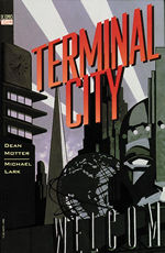 Writer: Dean Motter
Artist: Michael Lark
Colourist: Rick Taylor
Letterer: Willie Schubert
Collecting TERMINAL CITY #1-9
Price: $19.99
Publisher: DC Vertigo
ISBN: 1563893916
Since it's inception back in 1993, DC's Vertigo imprint has produced some of the very finest examples of the sequential art medium, and back in 1996 more-or-less everything Vertigo released was an essential purchase. Much of this output remains in print today in trade paperback form, allowing future readers to pick up on various gems that they might otherwise have missed. One such buried treasure is Dean Motter's TERMINAL CITY.
TERMINAL CITY is set in a sprawling retro-futuristic metropolis, characterised by the bold art-deco architectural stylings of the multitudinous skyscrapers that make up the skyline. Gigantic monorails hang suspended above the streets, as zeppelins and flying wing aircraft circle overhead.
But the city has been in decline for many years, with the man-made Cast Iron Beach fallen into disrepair and the Promethean Construction Company having ceased work. The hosting of the Brave New World's Fair over ten years previously had been intended to revitalise the economy, but an unfortunate incident during a publicity stunt involving Human Fly Cosmo Quinn soured the atmosphere, and the decay continued unchecked.
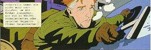
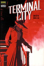
As we join the story, Quinn is using his wallcrawling skills to make ends meet as a window washer among the Terminal City skyscrapers. But when a mysterious amnesiac carrying a locked suitcase (with a connection to the incident that ruined Quinn's reputation) drops in, Quinn sees a chance to clear his name. Unfortunately many of Terminal City's more nefarious and mysterious inhabitants are also interested in the contents of the case, from midget albino gangster Li'l Big Lil, to Monique the enigmatic and mute Lady in Red.
 Life in the city is complex, and weaving in and around this main thread are also - among other things - the arrival of BB (a young idealistic construction worker), the return of the great showman Monty Vickers and a series of attempted murders. Add in a boxer's comeback that culminates in a fight with the Missing Link, and it can be seen that life in the city isn't dull, either.
At the time of TERMINAL CITY, Motter was probably best known for MISTER X, the story of a man haunted by guilt after coming to believe that a city he had designed had become mentally damaging to it's occupants. His previous Vertigo work had been the HEART OF THE BEAST graphic novel, in which the environs of New York City were an important story element. Given these architectural inclinations, it's understandable that the real star of TERMINAL CITY is the city itself, becoming a major character in much the same way as Opal City in James Robinson's STARMAN and - to a lesser extent - Kurt Busiek's similarly retro-futurist ASTRO CITY.
TERMINAL CITY itself is named for the fact that it lies at the crossroads of a number of transport routes. We see the Zeppelin terminal as BB arrives, and there are scheduled flights to Gotham City, Metropolis (whether the home of Superman or the creation of Fritz Lang) and even Radiant City, the setting of Motter's MISTER X. Even Opal City is visible as a destination on one of the departure boards.
But the city also earns the terminal appellation in another sense, in that becomes the end of the line for characters like Quinn, marooned there with his reputation in tatters, or BB, the construction work she's seeking having long since dried up. There's also a sense of finality with the city itself being in decline.
One of the major locations in the early part of the story is the Promethean Arms, a giant hotel, its fall into disrepair mirroring that of the city. The building still maintains some retro-futuristic trappings though, with messages passed by pneumatic tube, and the bulk of the staff being comprised of robots that wouldn't have looked out of place in 1960's films such as LOST IN SPACE or THIS ISLAND EARTH.
These also give Motter the opportunity to include a FAWLTY TOWERS riff in the shape of the ongoing conflict between the cantankerous Bazil robot on the front desk, and the hapless human bellhop who he disparagingly refers to as "Manual". Other character names are often chosen puns (the explorer Oliver DiMappe is probably the most groan inducing) or make reference to important influences, such as giving the mayor of this Brave New World the name Al Huxley.
Motter's playful nature also appears to have rubbed off on artist Michael Lark, with a selection of in-jokes littering the backgrounds. From name-checking DC editor Karen Berger via the "Karen's Burgers" fast-food stall, through the "Wanted" poster for MISTER X, to the Dalek in the yard of a Used Robot salesman, Lark ensures that his seemingly simplistic backdrops are always worth a second look.
 The style of the city is something that Motter terms Antique Futurism. To quote Peter Bergman from the trade paperback introduction: "Terminal City is a metropolis that made it into the nineties, but actually stopped dead somewhere in the fifties."
The architecture of the city borrows elements from a variety of sources, most noticeably the World's Fairs of 1939 and 1964. These first appear as early as the cover of issue one (all nine covers, three each from Matt Wagner, Mark Chiarello and Motter, are collected in the trade paperback), which was also re-coloured to act as the cover for the trade paperback. Clearly visible in Chiarello's striking image are structures modelled on the needle-like Trylon tower from the '39 fair and the massive steel-mesh Unisphere globe from the '64 event.
Another major feature of the city architecture is the "Colossus of Roads", a giant statue to rival the ancient Greek Wonder of the World. Or it would've been, had construction been completed. With the colossus being one of the casualties of the city's economic downturn, just the head exists. Throughout the story the head can often be seen in the background, peering through the gaps in the buildings as mute reminder of the city's former glories and what it might have been.
Michael Lark captures the decaying grandeur of the city perfectly in bold geometric shapes uncluttered by superfluous detail. Rick Taylor does sterling work with an understated colouring job that prevents the angular structures from being too garish. Even letterer Willie Schubert gets the opportunity to pull a few tricks out of the bag as - in addition to the standard text in the stylish rectangular speech bubbles - he has to letter the typed memoirs of Cosmo Quinn and the hand-written diary of the mysterious Monique.
TERMINAL CITY writer Dean Motter is currently writing and drawing ELECTROPOLIS, a similarly styled series for Image. A preview trailer is available at banook.com. Lark also gets to show off his versatility when the story periodically slips into black and white newsreel footage as a device to fill in background information on items such as the early careers of Cosmo Quinn and Monty Vickers. In a final challenge to his artist, Motter often gives Lark just a single panel to describe a past event, such as the suspicious deaths of many of Quinn's contemporary daredevils. The fact that these tiny panels - such as one showing an escapologist's sarcophagus being accidentally dropped into a shark tank - tell a story by themselves is testimony to Lark's skills.
With all the participants on such top form, it was hardly surprising that the series garnered a nomination for Best Limited Series at the 1997 Eisner awards. (It lost to the much hyped Mark Waid/Alex Ross epic KINGDOM COME.) A second miniseries followed, entitled TERMINAL CITY: AERIAL GRAFFITI, but criminally it has never been collected.
If the work has a major flaw, then it would be that the enormous number of characters and subplots could overwhelm less attentive readers. As with films such as SHORT CUTS or MAGNOLIA, some of these are crucial elements of the whole, others are largely peripheral, but do briefly brush against the larger themes to provide plot impetus, and still others never directly encroach on the central narrative. Personally I think these are all worthy of inclusion in that they add texture and richness to the portrayal of life in the City To End All Cities, and further enhance the feel that the city itself is the star of our brief voyeuristic visit.
Providing the reader isn't expecting a simple single-threaded plot, then a visit to TERMINAL CITY is highly recommended.

This article is Ideological Freeware. The author grants permission for its reproduction and redistribution by private individuals on condition that the author and source of the article are clearly shown, no charge is made, and the whole article is reproduced intact, including this notice.
All contents
©2001-5