FEATURES
REVIEWS EDITORIALS
THINGS TO COME
ARTICLE 10

>> Editorial: Cassandra Complex: Curtain Calls & Cyberpunx
>> Editorial: Cassandra Complex - Writers & Wringers
More...

XYLIN ROOM
Is it almost Bristol already?
In a week's time, the annual British Comics Festival takes place in Bristol. I'm going, as are most of the people I know through comics in the UK, and it should be a good laugh. I've been looking forward to it since the start of the year.
The only problem is, up until a few days ago I thought it was about a month or so away. In truth, it's been perpetually "a month or so away" in my head since around February, and I've been using it as a sort of self-imposed deadline; have to get this done before Bristol, want to get that finished before Bristol, be nice to have [insert comic here] written before Bristol, that sort of thing.
'I couldn't remember what day it was. At all.' These are, as I say, self-imposed deadlines. Real, cast-in-stone deadlines I take very seriously - an after-effect of five years working in the monthly magazine industry, where missing a deadline is simply not an option. You can't print blank pages and expect people to buy them.
So I've never missed a writing deadline in my life. Ask me when something needs to be written by, relative to today, and I'll tell you immediately - next Friday, two weeks Tuesday, whatever. But ask me what day it is? What the date is? What month we're in?
Haven't got a bloody clue.
Two things brought this home to me recently. One was leaping out of my chair in panic when my girlfriend gently informed me that yes, Bristol was in two weeks' time, not "a month or so away."
The other was when I couldn't remember what day it was. At all. Which might not have been so bad, had it not been Monday - and I'd taken the Sunday off. I'd been back at work less than a full day, and already I'd forgotten what day that was.
This, I submit, is the curse of the freelancer, and when I gave it some thought I realised just how paradoxically odd a life it is.
I say "paradoxically" because it's a nice long word, but here's the thing: on the one hand, keeping track of time is essential. I have to know when work is due. I have to know when people will be in so that I can call them. I have to know how much time remains for me to finish a job.
'It's increasingly apparent why writers have reputations for being odd.' But on the other hand, none of this matters to anyone but me. A freelancer's world really does revolve around themselves, and what day of the week it is doesn't matter in the slightest unless it's a deadline day.
Matters aren't helped by the hermetic nature of the job, of course. I'm not repeatedly exposed to public clocks telling me the time, shop signs reminding me of their daily opening hours, or discarded copies of Metro on empty tube seats with the day and date printed on every page. I sit here, I drink lots of coffee, and I write. The local high street may as well be Borneo for all the difference it makes to me (and on more than one occasion I've caught myself in the mirror and thought I'd encountered the proverbial wild man).
It's increasingly apparent to me why writers and artists have gained reputations throughout history for being odd, misanthropic and/or just plain bonkers. Today we at least have telephones and the internet to give us some sanity-preserving human contact (even if we do use them solely to talk to other freelancers). But can you imagine how separated from the world at large a nineteenth-century novelist must have felt, cooped up for weeks at a time with literally no-one to talk to? Ye gods...
Madness. Great fun, but madness.
THEME OF SUDDEN ROUNDABOUT
It seems book covers are going non-figurative again.
The cover design of novels is an interesting area to watch, as it cycles through trends and phases. It's a very good indicator of fashion, at least here in the UK, and current advertising methodology; almost better than music design. The designer has more options than with film posters or DVD covers (perpetually dominated by two-big-heads syndrome to keep the stars happy), more leeway than with magazine covers (which must reflect the contents and make eye contact with the customer) and more tools to work with than non-fiction (which are generally focused on the subject, especially with biographies).
 Novel design, by comparison, can assume a certain amount of intelligence on the part of the consumer - if you're in the fiction section of a bookstore, chances are you're someone who reads regularly. Which gives the designer a lot of freedom to engage the customer's curiosity, to stimulate their imagination.
So imagine my surprise when, two or three years ago, I noticed an awful lot of comic-style art appearing on novel covers.
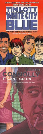
It started, as best I can remember, with Tim Lott's WHITE CITY BLUE. I never did find out who the artist was, but the Glyn Dillon-like illustration was plastered ten feet high on London tube posters for the better part of three months, and from there on a trend seemed to develop. Wendy Holden's BAD HEIR DAY, Alexandra Potter's GOING LA LA, even crime novelist Joseph Connolly's IT CAN'T GO ON; for almost a year, modern (and particularly 'urban') novels were covered with cartoons. For the time being, at least, non-figurative, purely atmospheric images were out of favour.
And now we've come round again. A couple of months ago I was in a local bookstore, just casually gazing at the fiction shelves, when I realised I couldn't see any figurative artwork. And not just comic style; on this particular day, the best-seller rack didn't have a single figurative image on it.
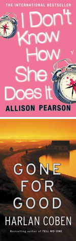
And this trend has, generally, continued. Even 'chick lit' books like Allison Pearson's I DON'T KNOW HOW SHE DOES IT, which two years ago would have been a safe bet for a cartoon cover, has a non-figurative cover. Agatha Christie, Harlan Coben and Michael Connelly have all recently had their entire output rebranded, in a completely non-figurative style. The cover to Ashok K Banker's new novel PRINCE OF AYODHYA is atmospheric in the extreme.
 Even fantasy, that stalwart of figurative illustration, has turned its back; Mary Gentle and Jean M Auel's entire line has been redesigned to coincide with their latest releases, and you guessed it, both lines are now non-figurative. The widespread use of figurative covers seems to now be restricted to 'chick lit' (again) and romance novels, which have never been anything but.
In two or three year's time it'll most likely turn again. We haven't had a rash of minimalist, Swiss-inspired typographical covers for a few years, so maybe they're due for a comeback.
Perhaps predictably, I find this most interesting when considered in comparison to graphic novel covers, and the lack of cyclical design in that field.
Graphic novels don't seem to have a cycle at all, being instead stuck in a perpetual standard of figurative design since their popular inception fifteen years ago. Rather than following and expanding on trends (or, god forbid, creating them), comics seems instead to rely on bandwagon-jumping. We have quantum leaps, singularities engineered by the sudden popularity of a single designer's style - which we then emulate to death within a year or two.
Jim Steranko. Dave McKean. Rian Hughes. Ashley Wood. These are all people who innovated, kick-starting styles and themes. These styles were very popular, and eventually became entire bandwagons. Superficial emulations flooded the contemporary market as everyone tried to capitalise on this success.
But the result of such flooding is that the emulators are left high and dry when an audience tires of it. Rather than developing into a general cyclical trend, the style suffers by recalling a very specific era of the form. And from there it's a long, uphill struggle to rehabilitate it some years down the line.
It took twenty long years for flares to become fashionable again, even in an industry which thrives on retro.
It's a shame, really, because it's certainly not the fault of the designers themselves. But like in so many other areas of comics, design follows the tenet that if it's popular, it should be copied. Again, and again, and again, until the audience is sick of it.
Who knows, perhaps we'll see McKean-esque covers become fashionable again in thirty year's time, appealing to an audience that has entirely forgotten the '90s. Of course, that would mean Steranko's due for a revival any time now - and sadly, I don't think that's on the cards.
RENIFORM PULS
autechre. draft 7.30. warpcd111. xylin room. iv vv iv vv viii. 6ie.cr. tapr. surripere. theme of sudden roundabout. vl al 5. p.:ntil. v-proc. reniform puls. 07/04/03. booth/brown. alex rutterford. gescom says: consume.

This article is Ideological Freeware. The author grants permission for its reproduction and redistribution by private individuals on condition that the author and source of the article are clearly shown, no charge is made, and the whole article is reproduced intact, including this notice.
All contents
©2001-5